This section will explain how to use the statistics panel in Tulip. The tutorial is composed of 3 main parts. Firstly, you will see how to generate a scatter plot or an histogram from a graph. In a second part, you will see how to enable augmented displays on the graph. And finally, you will see how to clusterize the graph from the statistics values previously computed.
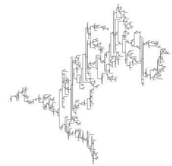
Every screenshots that will be shown in this tutorial are based on this tree :
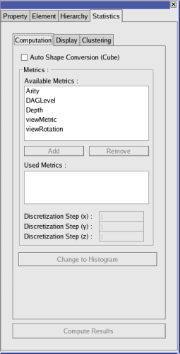
The first thing to understand about the statistics panel is how to generate an histogram or a scatter plot from the graph. The computation of histogram/scatter plot is based on metrics. So, in a first time, you will have to compute metrics. In the example, we have computed three metrics : Arity, DAGLevel and Depth. The new metrics are automatically updated on the Available Metrics list on the Stats panel :
Now that you have some metrics available. You can add them to the Used Metrics list simply using the Add and Remove buttons. The number of dimensions of the result will only depend of the numbers of metrics you add to the list. With only one metric added, you will have an frequency histogram displayed. With two (resp three) metrics you will have a 2D (resp. 3D) scatter plot. Each metric representing a different dimension.
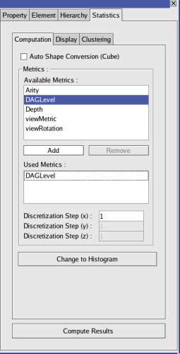
In the example, we have only added the DAGLevel metric to the Used Metrics list :
As you can see, adding a metric implies some changes in the interface. The bottom button becomes enabled, so as the edit box corresponding to Discretization Step 1. You can specify a discretization step, even if it is not really useful for our example.
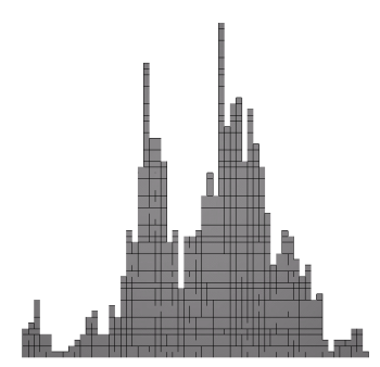
Now the last step before having a beautiful frequency histogram displayed : asking the panel to compute it. Just click on the Compute Histogram button. That's it !!! You have your first histogram : congratulations !!!
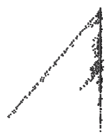
Now that we have an histogram. We are not going to stop here. Let's generate a scatter plot in three dimensions. Just add two other metrics to the Used Metrics list. You will notice that the text of the Compute Histogram button now becomes Compute Scatter Plot. Just click it and you will have a scatter plot.
Here is the result with our base tree and the three metrics mentionned in the introduction :
As a conclusion to this first part, you have learnt how to generate a simple frequency histogram from a graph and a metric. You have also learnt how to generate a whole scatter plot from 2 to 3 metrics. In the next part, you will learn how to display the basic statical values on the graph.
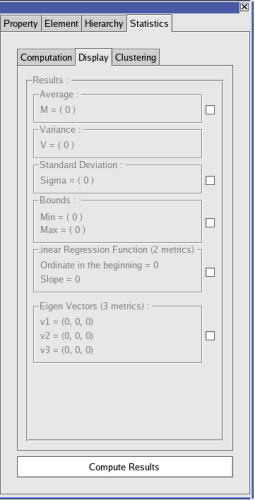
Now, we will see how to compute the main statistics results, and how to display them on the generated Histogram/Scatter Plot. Switch to the Display tab of the statistics panel. Yet, everything is grayed. To compute the values of the tab, you must click on the bottom button Compute Results. Note that this button is reachable on every tab on the panel but you will be able to click it only if the Used Metrics list of the Computation tab is not empty.
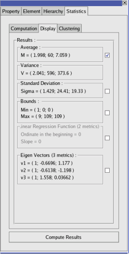
Once the results computed, most of the elements of the panel should be enabled. Note that the Regression Function group is enabled only if you hase two metrics in the Used Metrics list, and Eigenvectors is enabled only if you have three metrics in the Used Metrics list.
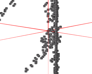
The checkboxes next to each groupboxes (except the Variance one) are used to display on the Histogram/Scatter plot, the result of the group. For example : checking the checkbox next to Average will display the average point on the graph (an Axis Point in red (c.f. GlAugmentedDisplay in the developer handbook)).
Every augmented display works the same way. You will just have to click on the checkbox next to the group to enable the display of the result. Note that you can't display the Variance since this result can't be represented in an interesting way on the graph. use instead the standard deviation.
Now that you know how to display the statistics results, you will see how to clusterize the scatter plot / histogram from these values.
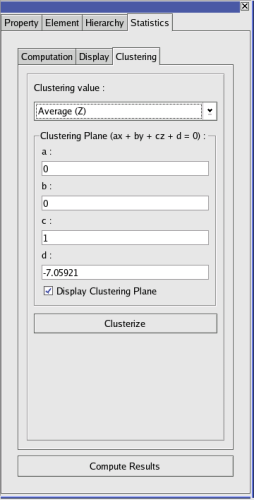
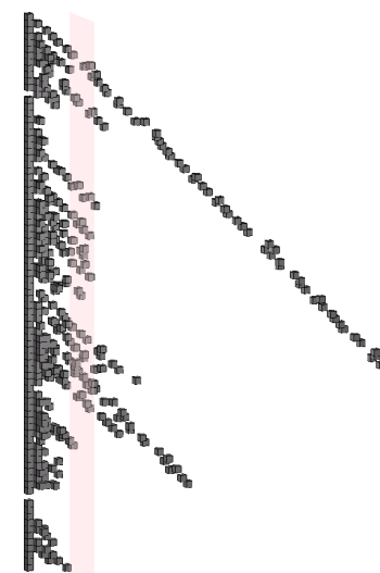
The last part of this tutorial will teach you how to clusterize from the statistics results previously computed. Firstly, switch to the Clustering tab. The Combobox Clustering Value lists the available start for a clustering plane depending on what has been computed before. Select Average (Z)(you must have selected 3 metrics), the plane coordinates will be modified according to the values of the average's Z coordinate. Check the Display Clustering Plane checkbox. The plane appears in transparent red, showing you the future two clusters.
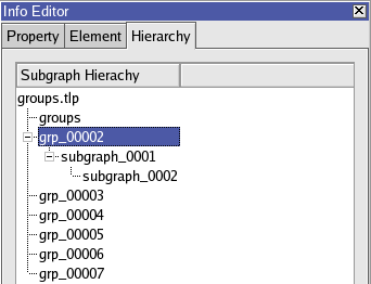
In order to have the good clustering, you can modify the plane equation (not really smooth : will be enhanced in the next versions of Tulip) to move the plane. Finally, to clusterize, just click on the Clusterize button. That's it ! The graph is now clusterized. In order to ensure, just check the Cluster Tree.
As a conclusion, you have learnt how to use the statistics panel of Tulip. As you can see, obtaining results is easy and fast. If you have any question about that panel, you can contact it's creator at <maxime.delorme@gmail.com>
